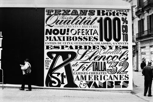
When you're getting ready to use printed graphics such as window clings, banners, or even restaurant menus, the first thing you should think about is visual appeal. A key to creating visually stimulating printed graphics is to have easy-to-read typefaces that can be read from a distance as well as look good.
OrphicPixel.com posted a great article about choosing a typeface that can be read easily at a distance, giving you the optimal advertising that you're going for.
How to Choose a Typeface for Easy Long-Distance Reading
No matter what project you are using typeface for, there are a few rules that make the going easier; these rules can apply to print or web design. The main thing you want, of course, is to maintain a highly readable product; one that not only keeps your audience engaged, but one that is also attractive and easy to access.
Using Only Two Fonts
The very first thing you want to consider is consistency, especially in all the visual elements. In order to attain this you will have to trim your font choices to only two.
That’s right, two.
This is possibly the most important rule for easy reading. Use only two typefaces and the possibility of your audience staying on the page or on the site has increased 100 fold.
Text is No. 1
Your first font choice should be for your text, as this is the most important typeface choice. The text font needs to be highly readable and easy to scan. Because the text holds all your important information, you want to make absolutely sure that you are choosing the typeface that will capture your readers and make reading your material enjoyable.
The next and only other typeface choice should be for headlines and possibly subtitles. Since this typeface is bigger and bolder, you can make it a fancier font. Nevertheless, the two fonts are going to need to blend harmoniously together without necessarily looking alike.
X-Height? What’s That?
When choosing and matching your complimentary font choices, make sure that your text typeface has what is known as x-height. X-height means that the bowl of a letter, like the round part of the b or d, is about two-thirds the height of its stem. Anything smaller than this can be difficult to read, especially if you are designing for the web. Remember, this is the most important choice you will make for audience or customer retention.
Second in Importance Are Headlines
Once you've chosen your preferred typeface, with good x-height, for your text, it is then time to select the second typeface for headings. One sure way to quickly determine if the second font will work is to look at the letters a, e, and g. Although you do not want your two choices to look too much alike, you do want to maintain the readability. The best choices to partner are typefaces that are similar in these three letters. This is true whether one font is a serif and the other is sans serif. Compare these letters and then make a choice that will create a comfortable reading experience.
Be Creative
On the other hand, don't be afraid of contrast if it suits your needs and your product. Realize that two fonts that are too much alike will also have a negative effect.
So, even though the first priority is to be able to give your audience a comfortable read, don't be afraid to show some creativity and, above all, have a little fun.
Choose your fonts and get started with your printed graphics by calling us at 1-800-877-3776 today!


