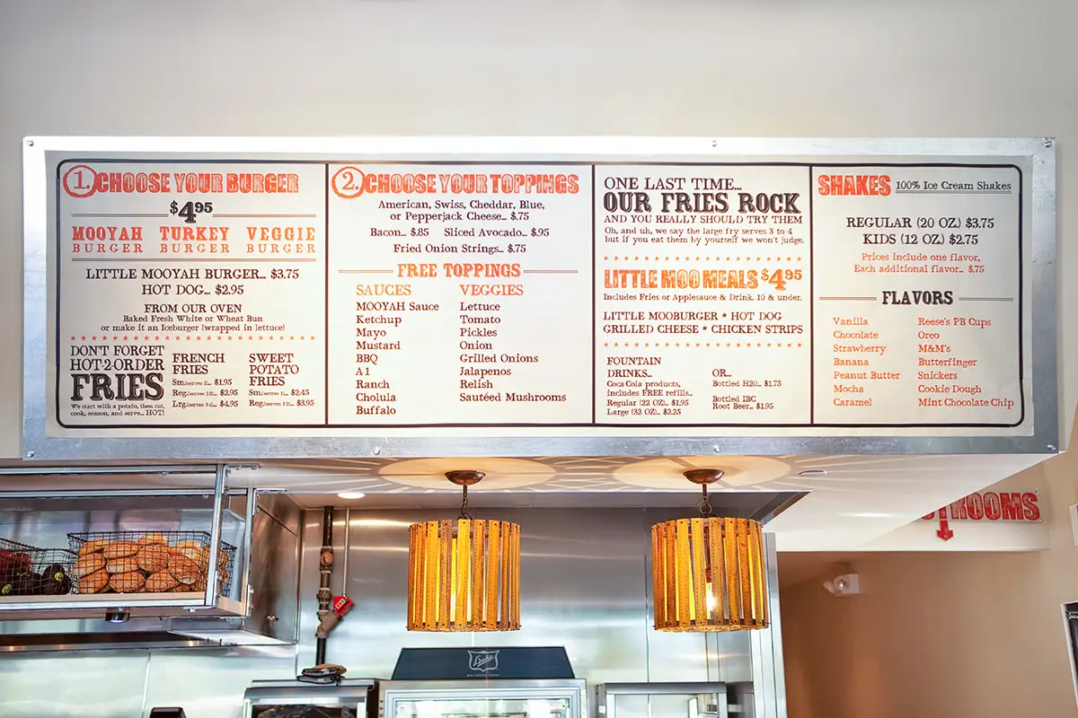
When the federal menu-labeling law goes into effect this year, restaurants with 20 or more locations will need to provide calorie counts on menus and menuboards. Experts say the calorie shuffle presents a good opportunity for restaurants to reevaluate their menu strategy and menuboard design, two elements that, if done right, should soften any blow from the labeling mandate.
Some operators are uncertain of the consequences of the menu-labeling law. Many fear that customers, when presented with a 900-calorie sandwich on the menu, might suddenly lose their appetite for fast food.
But Howland Blackiston, a principal at design and branding company King-Casey, says operators can rest assured this won't be the case.
"A lot of folks are panicking, saying, 'We have to put calories on the menu, we're going to lose business, and people are not going to come anymore,'" Blackiston says. "But [for] the brands that we worked with who have initiated this and already put calories on [the menu], long term, it doesn't really impact sales. It may impact the mix. People might be ordering different things, but they're not necessarily ordering less."
Blackiston says the best way to ensure a brand survives the menu-labeling mandate and continues to offer the products customers desire is to tighten its menu strategy. He says it is surprising to see how many quick-serve operators don't have a clear menu strategy, even though it can help achieve increased sales.
"Many of [the brands we work with] don't have a menu strategy, or they haven't formalized it in any way," he says. "It exists a little bit here, and someone else has got information over there. They sort of cobble something together."
A menu strategy, he says, identifies and prioritizes a brand's desired business objectives as it relates to the food and beverage products offered. Not only does such a strategy sharpen how a brand communicates its product to customers, but it also drives its business goals, Blackiston says.
A good menu strategy should start with visionary goals, followed by tactical business goals that correspond to performance, such as growing sales and profits, Blackiston says.
If a goal is to increase beverage sales, "it may impact your menu strategy because you decide to add an additional cup size to improve sales performance," he says. "Rather than two sizes of beverage cups, you may have three sizes. This may encourage more people to default to the middle size, which will increase sales."
Compared to consumers of the past, today's diners place a greater emphasis on value than anything else, says Lisken Kastalanych, vice president of marketing at Pollo Campero. This plays a critical part in any quick serve's menu strategy, she says.
"I think value has been redefined," Kastalanych says. "If [people are] going to go out and pay these days, quality is even more important, because they have fewer dollars to spend and they want to make sure they're spending it right."
Kastalanych says what is important to highlight on a menu is an attractive quality-to-price ratio. An operator who markets menuboard items that are high on quality and moderate on price pleases customers, she says.
Having multiple price points on the menu offers an opportunity to show off a desirable quality-to-price ratio, Kastalanych says. For example, when Pollo Campero debuted a modern store design and expanded menu in a store in September, the Latin chicken chain invented a menu section called Tapas & Tastings to tempt customers with a bite-sized meal for less than $4.
Once a clear menu strategy is set, the menuboard itself becomes an important tool for communicating that strategy to customers. The experts say menuboards should be carefully constructed to maximize the returns on the menu strategy.
"Most guests read the board even if they have a preconceived notion of what they want to order," says Kimberly Schwank, senior marketing manager at the Coca-Cola Company. "I can tell you that a successful menuboard should incorporate five key attributes: photos, organization, readability and simplicity, use of color, and information."
Blackiston says clarity and simplicity are especially important with consumers.
A neat menuboard influences the success of its core parts, he says. In terms of organization and information, the center of the menu is a hot spot, naturally drawing in consumers' eyes first. Placing the most popular and frequently ordered items in the hot spot ensures hungry patrons find them faster, Blackiston says.
Pollo Campero's new prototype proves this theory: The menuboard presents desserts in the middle of the menuboard, right below the top seller, chicken.
"We display desserts front and center, so our dessert mix at this restaurant has been much higher by actively displaying them," Kastalanych says.
La Madeleine introduced its bakery-café concept in October with digital menuboards that include a photo on each board panel.
"We try to have a photo for each category to help the guests' eyes navigate toward what they're in the mood for," says Stephanie Miller, La Madeleine's senior manager of brand marketing.
Miller says operators shouldn't forget how these strategies relate to the customer experience.
"We installed horizontal boards, and from guest feedback we heard they were a little bit harder to read," Miller says. "The [new, vertical] menuboards were truly a response to that need for an overall better experience for our guests."
Get started on your restaurant graphics today!
Read the original article here.


